Original size 2480x3500
New Moscow. Territorial branding
Longread translated automatically
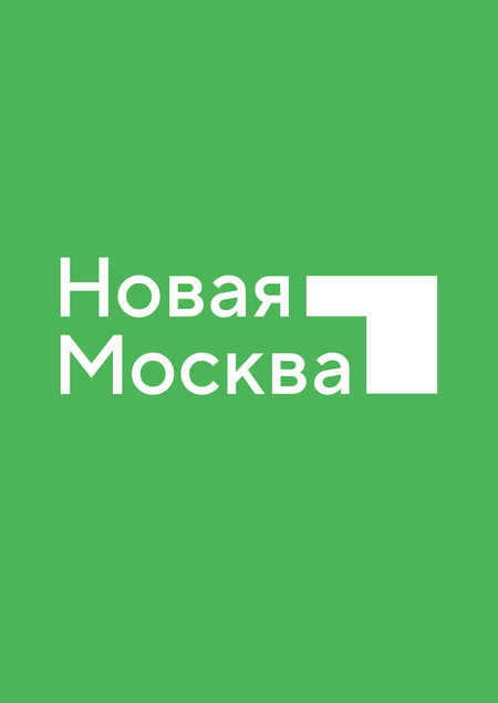
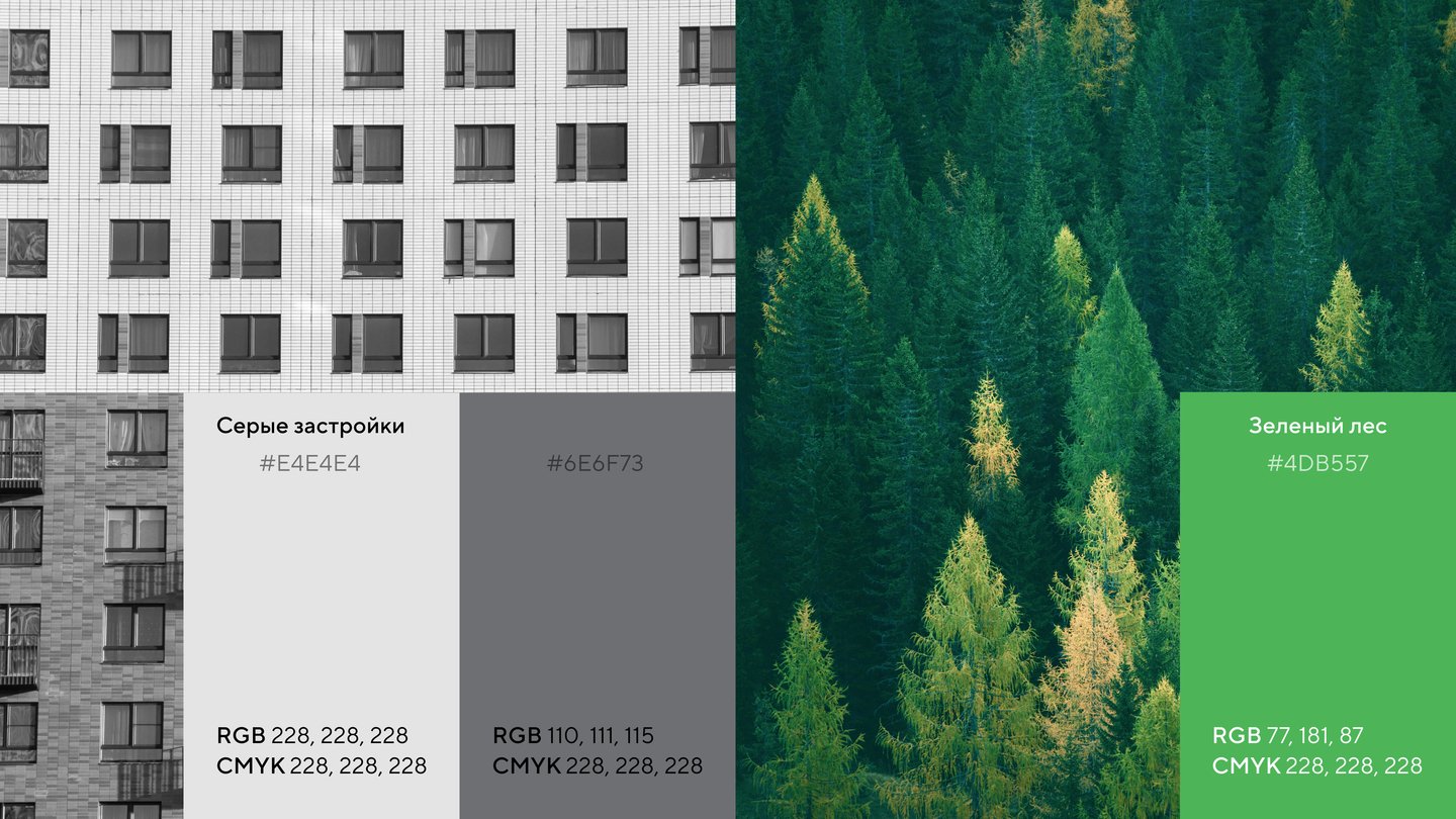
The New Moscow brand style focuses on the obvious benefits of the Territory: the ecology and dynamic expansion not only of borders, but also of the opportunities that this growth offers for the people of Tinao.
Original size 3840x2160
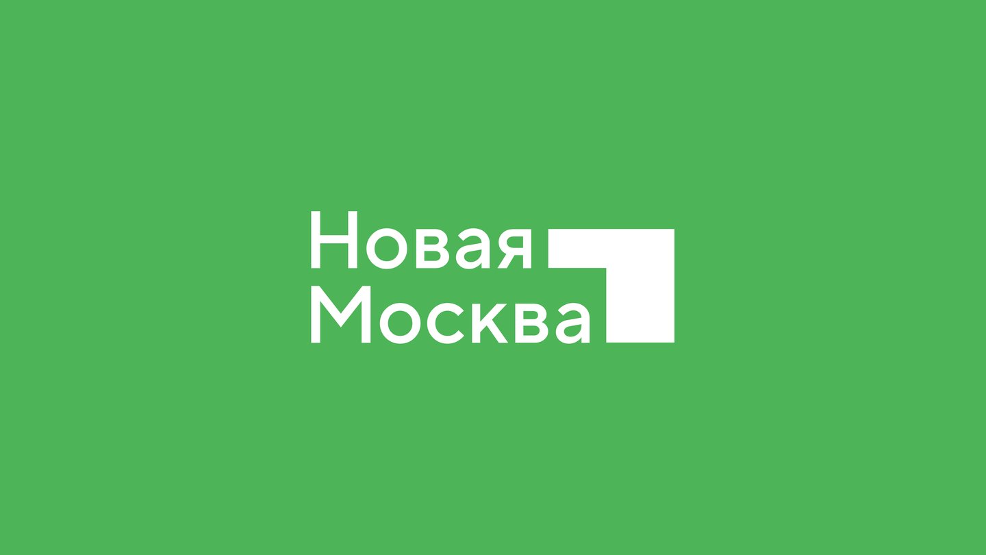
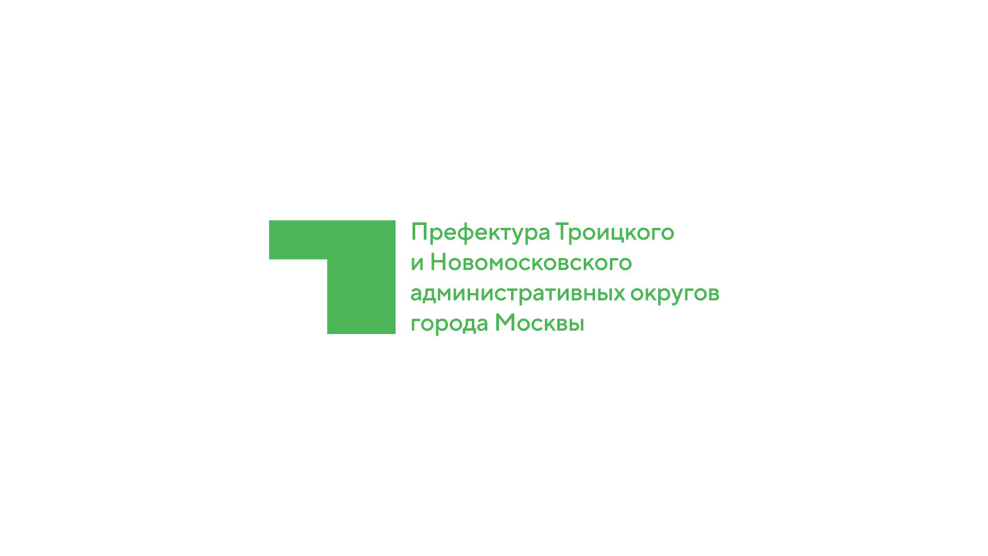
The New Moscow logo is not so much an annex to an already existing territory (if we’re talking about Moscow), but a new detail that forms a complete, monumental structure, a new structure. The angle resembles an arrow facing up and moving towards development, and also creates a mainly logo sense of space.
Original size 3840x2160
Original size 3840x2160


Original size 3840x2160
Original size 3840x2160
Original size 3840x2160
Original size 3840x2160
Original size 3840x2160
Original size 3840x2160
Original size 3840x2160
Original size 3840x2160
Original size 3840x2160
Original size 3840x2160
Original size 3840x2160
Original size 3840x2160
Original size 3840x2160
Original size 3840x2160
Original size 3840x2160
Original size 3840x2160
Original size 3840x2160
Original size 3840x2160
Original size 3840x2160
Original size 3840x2160
Original size 3840x2160
Original size 2880x1620
New Moscow. Territorial branding
More projects in identity & branding


